Monday, 13 December 2010

Total Guitar Magazine Analysis

Cover
The cover comes across as very stylish, with lots of writing and names of songs and bands to try and attract people who are interested in music. The main focus is on the cover star; Johnny Marr, which features a picture of him holding a beat up looking Fender guitar, showing road experience and memories of good times, which give the audience an impression of an experienced player. The background is a greyish colour, and from the looks of things was taken in a small room somewhere with the flash on. The main things which stand out on the cover is his name (Johnny Marr) and the magazine’s title (Total Guitar). The title appears to be beaten up with strips of paint missing, again giving the connotation of being experienced and road tested.

These features suit the theme of music and guitar playing very well. There’s loads of information on the articles, both specific to that issue (interviews, reviews, etc) and regulars (nail a technique, learn to play, etc). The tagline/usp of the magazine being “Europe’s Best-Selling Guitar Magazine” stands out very well, located in the upper right hand segment of the space allocated to the title. This attracts people looking for a reputable magazine; especially considering the subject of being taught to play an instrument it’s easy to feel overwhelmed.

The cover also contains essential information which is located on every issue, such as barcode, price, issue number, issue date, publisher, website, contact information, etc. A CD/DVD is also with each issue of the magazine with lots of useful content for guitarists, such as backing tracks to jam along to and lessons for beginners and advanced players.

Contents
The contents page is a lot more basic than the cover. This continues the use of large pictures designed to make the cover story (Johnny Marr) stand out. There are only 2 other pictures, 1 being of a guitar in the reviews section, and the other being a cartoon of a hospital patient (humorous addressing the article on health & safety whilst playing such as RSI, Tinnitus, etc). These pictures are located to the right of the contents page whilst the small print summarising each section is located to the left. On the bottom right hand corner is also a page number and a small print of the title of the magazine’s name.

The colour scheme is fairly basic. Uses of red, black, white and a touch of yellow make the pictures stand out more, especially the cartoon. This is a continuation of the same colour scheme of the cover. However the cover does use a black/white background (photo flash effect) whereas the contents is purely a white background. This basic colour scheme creates a simplistic, punkish look, common associated with guitar.

Article
The article I chose to write about is “Nail a technique in a month” which is designed to teach guitarists to practise new techniques they may be unfamiliar with. I chose this article because I had the idea to do something similar in my Practise magazine for Music Technology students. The one in the issue I have been analysing involves exercises with the whammy bar. This article is a regular in Total Guitar and has been for some time. This article comes under the section “Monitor” which covers articles such as interviews. There is a continuation of the red, black, white and minimal amounts of yellow again. They use images of Nails as a pun on the title of the article; this has connotations of being firmly set in place, which is what the article aims to do with the technique’s exercises for the audience.

At the top of the article is what technique the article is on this month and what number it is (for example this issue’s version is #17). Below that is a short paragraph on the background of the technique you’ll be learning about and where’s it’s been used (as a cross reference for the reader). Then the exercises are set out as weeks. For example week one has easy, beginner uses of the technique to start building a foundation, week two is slightly harder, week three builds on week one and week four is a combination of the others. All of these exercises are found on the included CD. They are designed to keep the readers busy until the next issue (monthly). Under each exercise is a brief explanation of what techniques are involved and what they’re called to educate readers on what it is exactly that they are learning.

Target Audience

Target Audience
This is Wayne and he is an example of my target audience. From my questionnaire I found that the most common age for getting into music is around 12 - 14. Wayne is about 14. He lives at home and goes to secondary school. In his spare time he enjoys a game of football with his mates and playing video games. He comes from a middle class family and gets around £5 - £10 pocket money. He sometimes reads magazines and enjoys special issues. He usually reads about his other interests, such as Football and Gaming. He will most likely share magazines with his friends as to save money.

Wayne is getting into music and wants to look into which genre he favours most. He’s heard Pop and Rock music on the radio but has only heard of other genres such as Reggae, Dance, Classical, R&B, Jazz, etc. There would have been a lot of talk in his life about classic artists and albums, whether it be from other magazines or TV. He is aware of few of the many gems in the world of music, as he requires a helping hand to discover them, that’s where my magazine will come in. It won’t cost too much as to make it affordable for people his age and will provide them with all information they need to discover the gems in the world of music.

Wednesday, 8 December 2010

Music Magazine Part 1

For my music magazine i decided to try and do something original. I looked into various music magazine and noticed the large number of Pop/Rock magazines which seemed popular genres to pick (Q, NME, Kerrang!, Classic Rock, etc). I decided against this as another one of these magazines wouldn't stand out, whereas originality would. My idea was to not focus on 1 genre that the audience already knows, but to focus on genres the audience are interested in looking into. The idea was to help young teenagers in discovering what genres they actually like by providing them with the information they need to look into each genre.

The idea behind this issue was classic albums
. The front cover picture will be a pile of classic albums from a wide range of genres to show the sheer amount of great albums out there and the wide range of options. The double page spread is going take classic albums from a genre (depending on results from questionnaire) and analyse them. I have design ideas in my head for this and am sure i can impliment them.

The CD will contine the idea of multiple genres
, giving the audience a chance to hear samples of some classic albums in a wide range of genres. However the key focus will be on whatever genre comes out top in the questionnaire.

Student Magazine Part 2

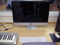
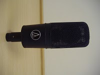
I have now taken photos of various things around the studio at school and used them in my magazine, I took several photos and these were the ones which came out best:


A pair of headphones used in the Contents page.


The iMac used on the front cover as a background image.


A speaker not used in the magazine.


Another shot of the iMac, with Keyboard, Mouse and MIDI Keyboard in shot, used on Contents page.


An SM58 Microphone, used on the contents page.


An Audio Technica Condenser Microphone, used on the contents page.


The front cover. The title 'Student Productions' is Dark Blue, used to create a distinctive colour scheme which stands out from other magazines. The Blue text box points out the main subject in this month's issue, Multi-track ideas. A big issue for Music Technology students (from experience).


The contents page, note the use of Dark Blue again, continuing the distinctive theme.


Overall the images create the impression that it is very technologically involved. The contents page was inspired heavily by Computer Music magazine. I thought about the number of pages to each section of the magazine and spaced them out over a sensible amount, considering the size of each section. I also added a small text box to the bottom of the page, saying which page the reader is currently on with the magazine's name.

I didn't have much time to piece everything together as I joined the course late, but have learned essential skills in putting together a good, stylish magazine, which will come in very helpful in my Coursework.

Student Magazine Part 1

I started off by looking at the subjects i am currently doing. The one that stood out the most was Music Technology. So i then studied a well known Music Production magazine called 'Computer Music'. They have built up a highly respectible reputation over the years in production and engineering circles.

My next step was to decide what content to include
, and what was relevant to the course at hand. I thought about where the course i was doing became difficult and where i could use some professional advice. I also thought about what students studying the subject would be intersted in reading about, such as reviews, previews and interviews.

When i had all these ideas written down i looked at how i would design the front cover
. We have a studio in school which i thought would be a good idea to use for a front cover photo. I thought about getting an action shot of 2/3 core elements of music technology - Capture (person playing guitar whilst another positions a microphone) and Mixing (a person on the computer mixing the parts together). I also wanted to include a person on the side, watching the producer and learning, just like the target audience. Only students were to be used in the photo as the target audience is students of this subject, it puts them in the spotlight.

I then went on to design the layout of the front cover on Microsoft Publisher
. Designing features such as position of title, subtitle (tagline), price (£2.99 - a realistic price for students), barcode (http://ceoworld.biz/ceo/wp-content/uploads/2009/11/barcode.png) and various text boxes containing information relating to the magazine's contents. I thought about what songs other people had used in their Multi Track Recording Task for AS Level and put these on the front cover as suggestions.

I used WordArt for Titles and Subtitles across the page and typed in Information such as Price and Magazine's features
.